main content point


The Meaning of CI
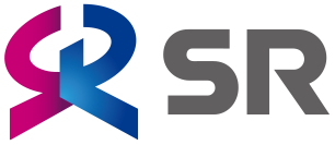
- The CI is a combination of the letter 'S' and 'R' representing the shape of a person embracing the world. It encapsulates the values of SR that provides customer satisfaction and assures their safety.
- The CI represents the shape of the new lines (Suseo, Dongtan, and Jije) and the existing high speed lines (Gyeongbu and Honam).
- Blue and red represent the harmony of yin and yang; the perpetualness of the company.
Logo Type
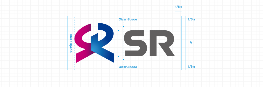
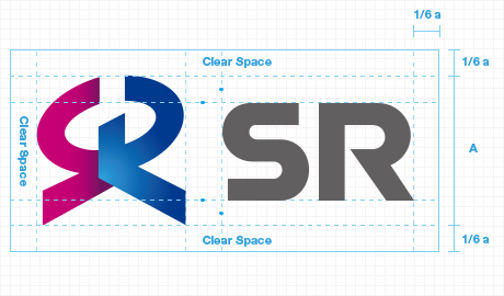
Isolation
* Spatial regulations are to regulate protection areas around the symbol to maximize its visual effects.
* It is prohibited to use any element within the clear spaces
Color Stystem
Main Color

C20 M100 Y15 K0C60 M100 Y30 K20
R199 G25 B125R109 G31 B96
Pantone 227CPantone 519C

C70 M20 Y0 K0C100 M80 Y0 K10
R51 G163 B220R3 G70 B148
Pantone 639CPantone 2738C

C20 M0 Y0 K77
R95 G96 B98
Pantone 425C
Sub Color

SR Silver
Pantone 887C

SR Gold
Pantone 883C
SR
Heerim Building, 12, Gwangpyeong-ro 56-gil, Gangnam-gu, Seoul, Korea
Copyright 2018. SR Inc. All rights reserved.
